Typeface
Case Study
Phoga
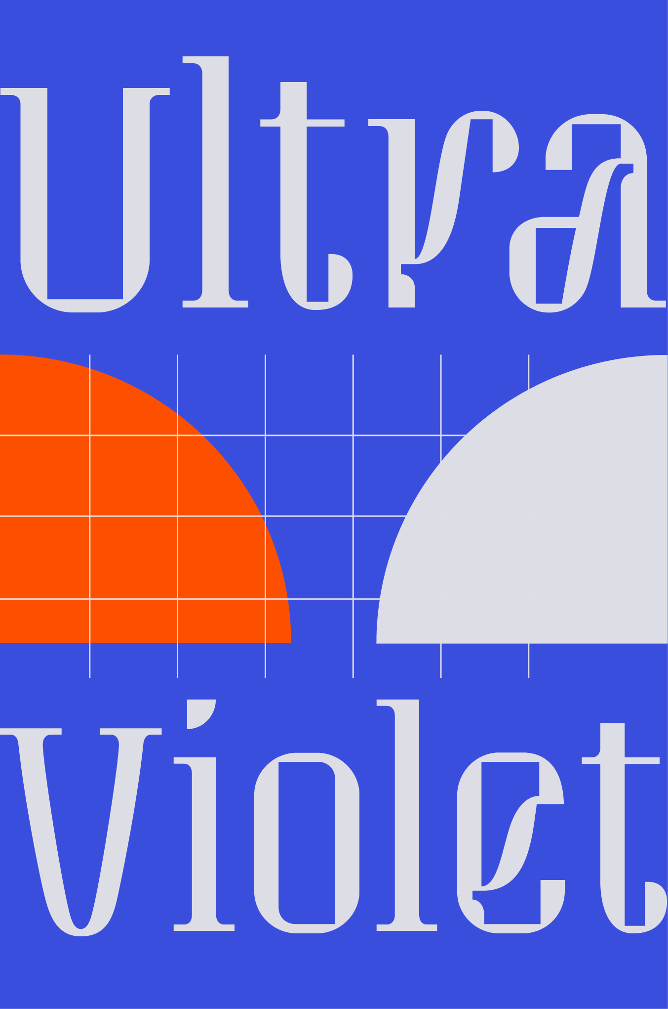
Phoga is filled with dynamic personality, combining a cold technological rigidity with tapered curves and flourishes you’ve only ever seen in script typefaces. This typeface takes the viewer on a unique rhythmic journey full of unexpected twists and turns.


Intersection of geometry and fluidity
This font is constructed of rectangles, semicircles, and quarter circles that are connected together by fluid strokes and interrupted by inktrap-esque negative spaces. Occupying the space between serif and sans-serif, letters’ terminals either end flourished by a swooping serif or are bluntly cut off, both options often seen in the same letterform.


Familial influence
I initially set out to design a font based on my pop-pop’s wooden artworks featuring Armenian letterforms made up of simple geometric shapes. While I ended up straying from this idea and designing something that was much more evocative of my personal style, the primary shapes at the core of this font remain evocative of his work. The name Phoga scrambles the letters of my pop-pop’s name, Hagop.
Creating a typeface
I started by compiling inspiration from Armenian typefaces, Latin typefaces that I thought resembled Armenian typography, and typefaces I just liked. I was able to narrow the images I found down to a select few that felt similar and that embodied the kind of typeface I wanted to create.

I then started broadly exploring different ways in which I could create letterforms out of geometric shapes. This involved some sketching on paper, but was mostly realized on illustrator, taking advantage of the rigidity of the vector shapes and the ability to easily iterate slight changes/slightly different copies of something over and over.

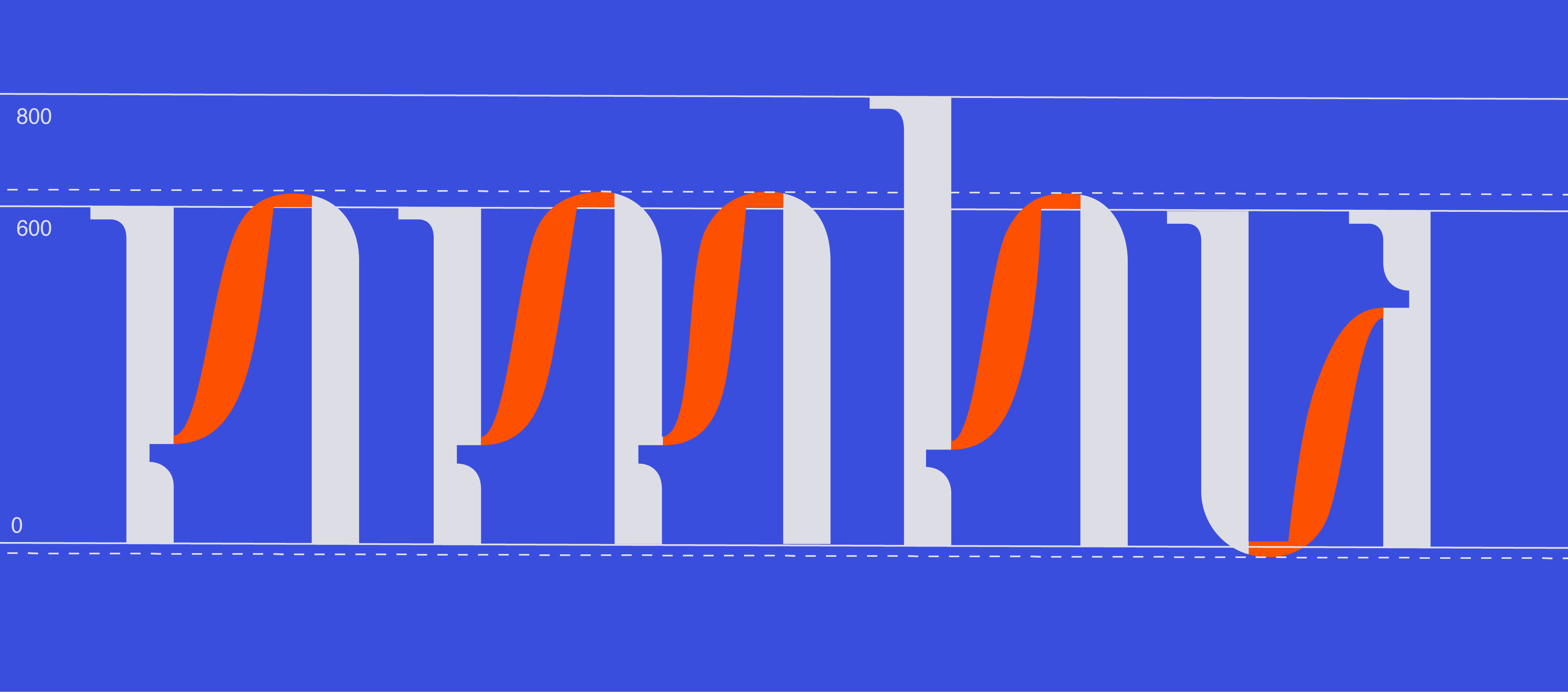
Through my explorations I gradually started realizing the forms that would become my final typeface by focusing on creating the “n” letterform, which has a structure that can act as a base for creating many other letters. The image below visually depicts this journey, where I finally was able to find a structure that felt right and that had multiple distinguishing elements that I could create a system for the entire alphabet with (parallel vertical strokes connected by a diagonal swoop, ink traps at the intersections, serifs at the top terminal).


My system was ultimately created by feeling out what worked and what didn’t work. The challenge was to apply the system I created for the n, m, h, u letterforms to very different letterforms like the t, k, and s. These different forms presented opportunities to create new elements to add to the system that would contribute to the typeface’s unique personality and work seamlessly alongside my previously established elements.


For example, one of the elements that I came up with further along in my exploration was the sort of curled terminal at the end of the “t”, which allowed the letterform to incorporate the inktrap motif. I was able to apply this terminal to the “k”, but because the application wasn’t super straightforward, I had to play around with incorporating it in different ways. I ended up moving forward the “k” in the middle, because using the curved terminal for both the top and bottom curved strokes felt the most appropriate and didn’t leave the letterform feeling unfinished.


The “a” letterform is an example of how my initial system of letterform elements led to unexpected and innovative letterforms down the road. I explored two fundamentally different ways to approach the “a” that would work with the rest of my alphabet, and I ended up going with the one that felt more unique in order to incorporate weirdness and personality.


Through my explorations I gradually started realizing the forms that would become my final typeface by focusing on creating the “n” letterform, which has a structure that can act as a base for creating many other letters. The image below visually depicts this journey, where I finally was able to find a structure that felt right and that had multiple distinguishing elements that I could create a system for the entire alphabet with (parallel vertical strokes connected by a diagonal swoop, ink traps at the intersections, serifs at the top terminal).


