Branding
Case Study
Free Library of Philadelphia
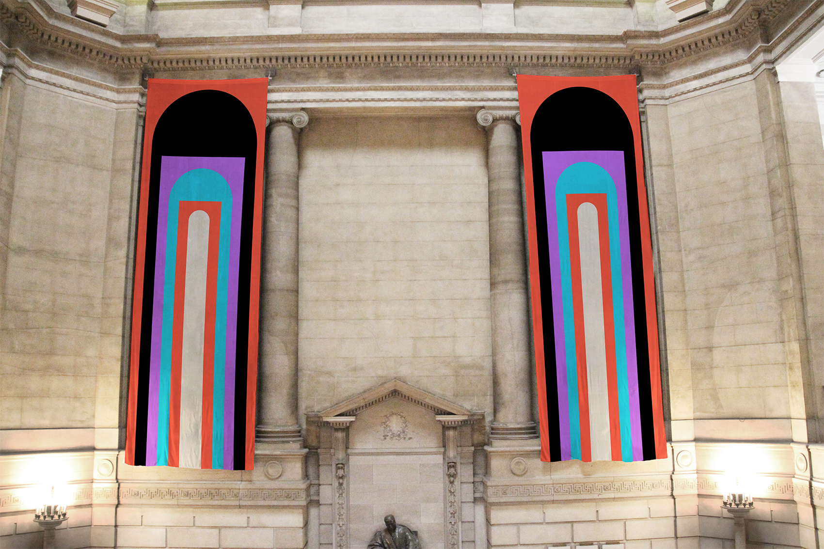
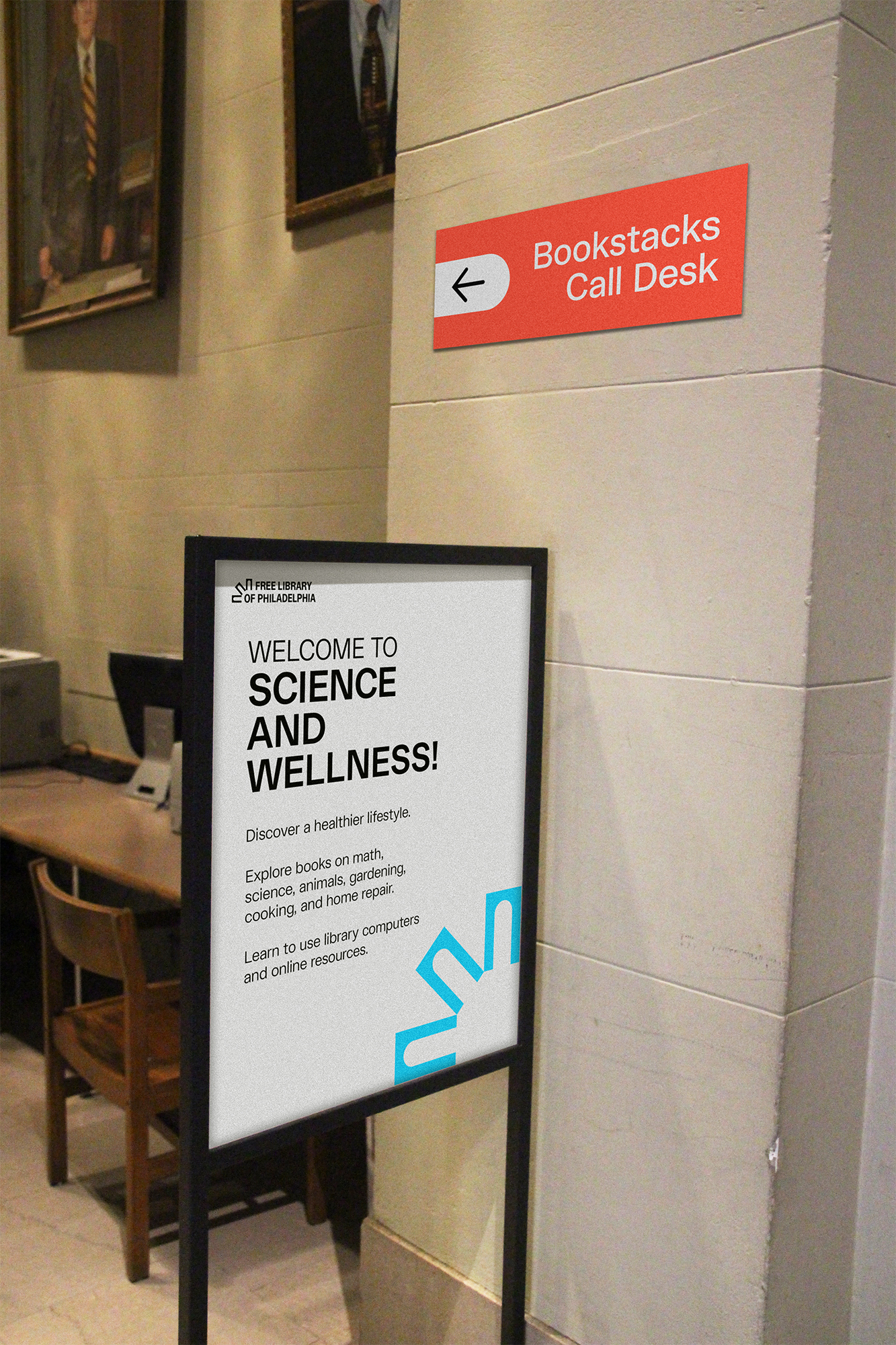
The Free Library of Philadelphia is a vibrant cultural and educational institution that’s devoted to building an enlightened community. This rebrand views the historic library through a re-energized lens, and communicates all it has to offer in an eye-catching, exciting, and direct way.
Inspiring Curiosity, Fostering Community
The library is more than just a place to check out books; it’s a hub for learning, exploration, and community engagement. I was surprised when I found out the plethora of things you can borrow, from workout kits to knitting needles. Accessible educational and material assets are especially instrumental in a city where many residents face economic setbacks.
The Problem
The Free Library's visual presence has previously neglected to reflect the lively role it plays in the city. I became passionate about developing a way to re-engage the general public with this often overlooked resource. Attention was paid to craft a visual system that was iconic and risky enough to demand attention, yet functional enough to be able to adapt to the wide range of applications that a public library would need.

Visual Research
At the beginning of my research process I explored other public library brands in order to see what’s been done before and how other designers have approached this challenge. My intended bold, modernized, and adaptable visual direction led my search for inspiration. I ended up with a compilation of modern logos that each found creative ways to work with iconography related to libraries, the unique location of the library, or both. I was inspired by these designers’ ability to abstract such iconography in order to create unique and flexible logomarks. I was also inspired by the simplicity of these logos, because the modern look they have feels appropriate, intentional, and approachable.


Shown above is a glimpse at some of my logo sketches. I went through the many photographs I took during my visit at the library and observed architectural details that I could potentially abstract, simplify, and turn into a mark.

Emphasizing Entryways
Shown above is a glimpse at some of my logo sketches. I went through the many photographs I took during my visit at the library and observed architectural details that I could potentially abstract, simplify, and turn into a mark.


Voice and Concept
Shown above is a glimpse at some of my logo sketches. I went through the many photographs I took during my visit at the library and observed architectural details that I could potentially abstract, simplify, and turn into a mark.


